


Our Lion Story
Honouring the past, shaping the future
The journey towards GREAT
As Singapore’s trusted insurer, Great Eastern has been at the forefront of Asia’s insurance industry for over a century. From our humble beginnings in 1908 to where we stand today, we have always strived for excellence. The lion logo has stayed true to our spirit and evolved with us over the years.
Making a GREAT first impression
Great Eastern’s origin dates back to 1908. Our founder – Alfred Hewton Fair – a former general insurance agent saw the potential for a local life assurance company tailored around the needs of Malayans, and whose culture the company adopted.
However, the road ahead wasn’t easy. There were already several foreign insurance companies present. The future of a new company, particularly a local one, appeared bleak.
Though this was an obstacle, it didn’t stop us. It inspired us to leap ahead and break new ground. With a vision to become the leading financial service provider in Asia recognised for excellence, we adopted the lion symbol as our logo. This felt like a natural fit, keeping the then Malayan locals in mind.
A symbol for the times
The lion logo represents courage, power, strength and leadership It is synonymous to our core values, and stands for what we believe in – to protect, preserve and grow what matters to our customers.
As Singapore’s oldest and most established life insurance company, we act with confidence and conviction. More importantly, we continue to inspire generations to Reach for Great and become the greatest versions of themselves.
The evolution of GREAT
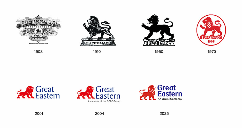
The lion logo has taken on many forms over the years.
In 1908, we took the first stride in establishing ourselves with the original Straits Settlement Period Heritage Crest.
1910 saw the birth of a roaring symbol, where the lion was transformed based on contemporary design trends. This also marked the first time that policy documents like the vintage cheque were graced by the lion.
In 1950, the lion was redefined. Our iconic logo was given a facelift with a simplified design while maintaining its sense of authority and trust.
1970 led to a symbol for a new era. Here, modern thinking led to minimal design, which was an ideal fit for the generation.
In 2001, the lion was freed from its cage and turned eastward. It signified a future-looking stance. This is the logo we still proudly use today.
In 2004, an endorser line to link us as a part of the OCBC group was added, adding further might to our logo.
In 2025, the lion reflects who we are today – a modern, resilient, and future-ready insurer, while staying true to the values of trust and care that built our legacy.
The lion logo is an extension of us at Great Eastern. It represents our constant endeavour to inspire change and help others Reach for Great.
Watch the story of how our lion logo has evolved here.